
-
Architects: Pitagoras Group
- Year: 2012
-
Photographs:João Morgado

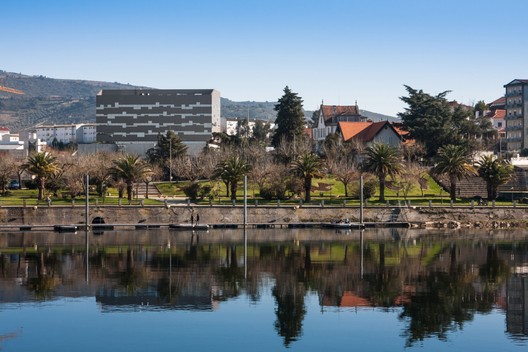
Text description provided by the architects. The land for the new Terra Quente Hospital lies within the city perimeter close to the railway station and the bus station and not far from a number of recent facilities, either developed by the municipality, the case of the swimming-pool complex, for instance, or by private entities, the case of Instituto Piaget. The plot of land is located at high level in a lofty position overlooking the city. It can be described as a platform that was formerly occupied by an old fertilizer plant, and which was the result of a cutting made on the south slope, the site of collective housing at a higher level. The criterion for the location also conditioned the volumetry of the building and its distribution into two clearly perceptible volumes – one varying between one and two storeys which develops along the largest part of the plot, with two volumes placed longitudinally above it, housing the consulting rooms, operating rooms and inpatients rooms, the continued care unit and the senior residence, in addition to the requisite technical areas.

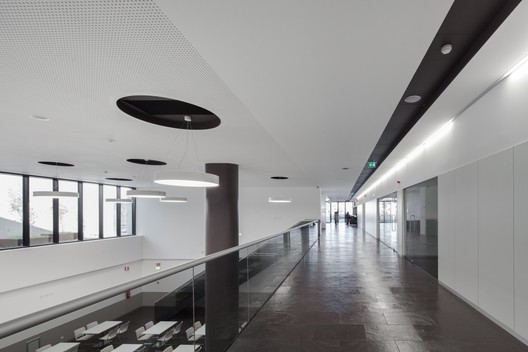
The programme of the new hospital envisages a number of diversified and complementary services in an attempt to meet local needs. It operates on line with other similar equipments which due to their proximity can provide an additional response and thus broadens the health care offer in question. In addition to the actual hospital, it has a continued care unit and a senior residence, he atter occupying the two upper floors of the building and presenting a separate entrance. Furthermore, admissions are immediately below this floor and Level 2 houses he outpatients’ consulting room and the operating rooms. Level 1 is set aside for hysiotherapy and the technical area for the sub-station of said operating rooms. The remaining spaces on Level 0, site of the main entrance, are for use, naturally, by complementary reas such as a permanent outpatients unit which focuses on diagnostic ests, including imagiology, and on outpatient care in paediatrics and gynaecology/ obstetrics. The programme also envisaged administrative areas, main entrance, at endance and public use – restaurant, seating areas and shops – as well as all technical nd support areas needed for the hospital to function.

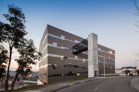
The realisation of this programme was translated into an apparent volumetry distributed on two wings, as mentioned earlier, plus a third, that is not apparent and mainly houses technical and support areas. Every attempt was made to ensure that internal and external circulations were as clear as possible and also met the principles of compositive simplicity which inform the entire project. In generic terms, we could describe the building as being structured with a main body that constitutes the base supporting the upper volume on four storeys, one storey being set back. Between these two bodies, a fifth storey houses the technical area and provides the volumetric transition to the upper wing. All have horizontal, linear circulations united by vertical circulations in the form of lifts and stairs.

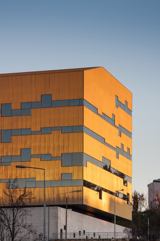
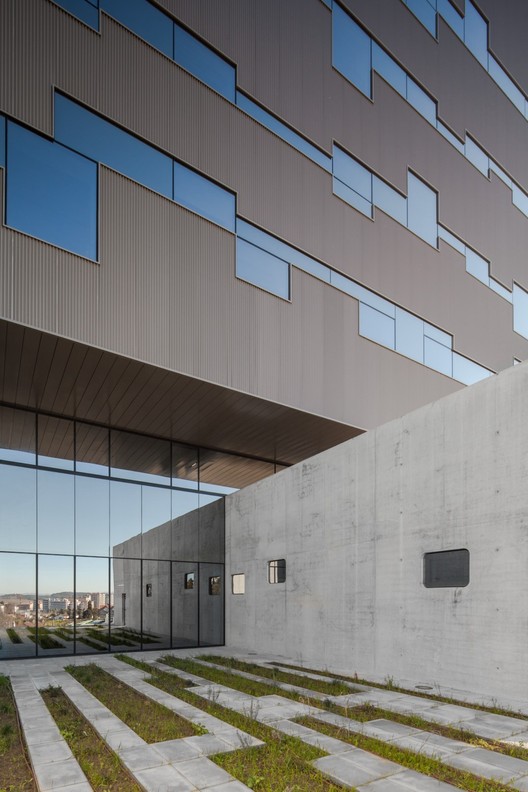
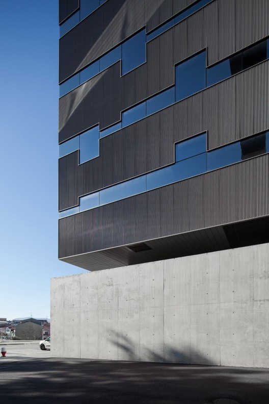
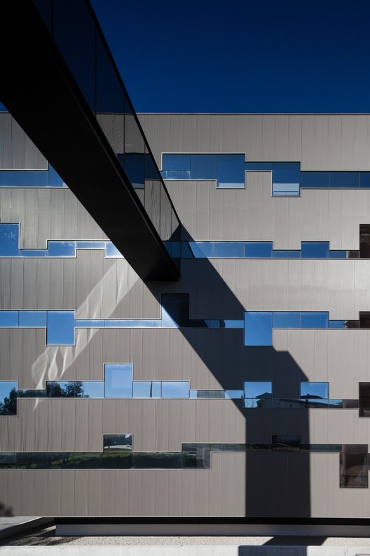
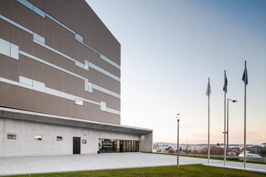
he final form and the architectural expression of the building will always be important, hat is, how it is seen by users – users of the building, of the city and of the territory and how they will assess its image. A priority, therefore, was that the building should assume an eminently public language, cale and character, that is unique and clearly identifiable. This was expressed in a compact, clearly formulated volumetry which is obviously reflected in the finishes. The treatment and the expression of the façades were designed to contribute to this aim of making the Terra Quente Hospital stand out from the built context, transforming it into a reference in the urban context. Whilst a first approach appears to show that the building is divided into the abovementioned volumes – upper and lower – corresponding to the different programmatic contents, the treatment and finish of the façades in uniformly coloured apparent concrete, confirms the attempt to unify and diminish the tension between the volumes of the base. This is reinforced by cladding the façades of the upper volume in prelacquered corrugated sheets and by creating lines of continuous windows around the building, achieved by linking the fenestration to sheets of glass that lighten this dimension and make it more vibrant, eliminating most of the impact of the volumetry. The aim is that, as a health care facility for regional use, the building should be visible and identifiable from the country roads. The architectural formulation and the functional resolution of the programme allow the building to be reconfigured in the future by adding similar modules in terms of composition and volumetry, namely in the west sector. This provides the necessary versatility, leaving it open to directions for its development.

The structural and building processes go hand in hand, and a structure in reinforced concrete was selected, using solid slabs – or fungiform slabs – supported on pillars and on the reinforced concrete outer walls, or thermal clay blocks which, once the thermal insulation and the external finishes have been applied, constitute the constructive system of the façades. The exterior finishing materials: apparent concrete, corrugated sheets and glass, in addition to the factors mentioned earlier, were chosen for their durability and ageing capacity but also because they allowed the realisation of a constructive process – ventilated façade – that jointly with the technical solutions of other specialities provides the requisite energy savings in the building. It was decided to divide the inner spaces with walls of plasterboard sheets. This system provides the requisite compatibility between the various types of acoustic insulation foreseen, both in the insulation between compartments, and in their internalm arrangement, as well as making any replacements easier to carry out.








.jpg?1410113733)
